

Introduction
CSS Grid is a layout module that allows you to create two-dimensional layouts on the web, with rows and columns, without having to use floats or positioning. It is supported by all modern browsers and offers many features and benefits for web design.
How CSS Grid Works
To use CSS Grid, you need to define a grid container and grid items. The grid container is the parent element that has the display: grid property. The grid items are the direct children of the grid container that are placed on the grid.
You can define the size and number of columns and rows in the grid container using the grid-template-columns and grid-template-rows properties. You can also use the repeat() function to create repeating patterns of columns or rows, and the minmax() function to set minimum and maximum sizes for them.
You can also create gaps between the columns and rows using the column-gap, row-gap, or gap properties. The gaps are also known as gutters.
You can position the grid items on the grid using various properties, such as:
grid-column-startandgrid-column-end: specify the column lines where the item starts and ends.grid-row-startandgrid-row-end: specify the row lines where the item starts and ends.grid-columnandgrid-row: shorthand properties for the start and end properties.grid-area: specify a name for the item or a shorthand for the start and end properties.grid-template-areas: define named areas on the grid and assign them to the items.
You can also use line numbers, negative numbers, or keywords like span or auto to place the items on the grid.
If you don’t explicitly position the items, they will be automatically placed on the grid according to the grid-auto-flow property, which controls the direction and order of placement.
Grid Properties
align-itemsandjustify-items: align and justify the items within their cells.align-selfandjustify-self: override the alignment and justification of individual items.align-contentandjustify-content: align and justify the tracks within the grid container.align-tracksandjustify-tracks: align and justify individual tracks.
Why CSS Grid is Useful
CSS Grid is useful for creating complex layouts that are responsive, flexible, and accessible. Some of the advantages of CSS Grid are:
It allows you to create layouts that are not possible or easy with other methods, such as overlapping items, spanning items across multiple tracks, or creating asymmetrical grids.
It gives you more control over the size, position, and layering of the items on the grid, without having to modify the HTML structure or use hacks.
It simplifies your code by reducing the need for nested elements, wrappers, or extra classes.
It makes your layout more adaptable to different screen sizes, resolutions, or orientations by using relative units, media queries, or auto-placement features.
It improves your layout’s accessibility by creating a logical order of content that matches the visual order, and by supporting screen readers and keyboard navigation.
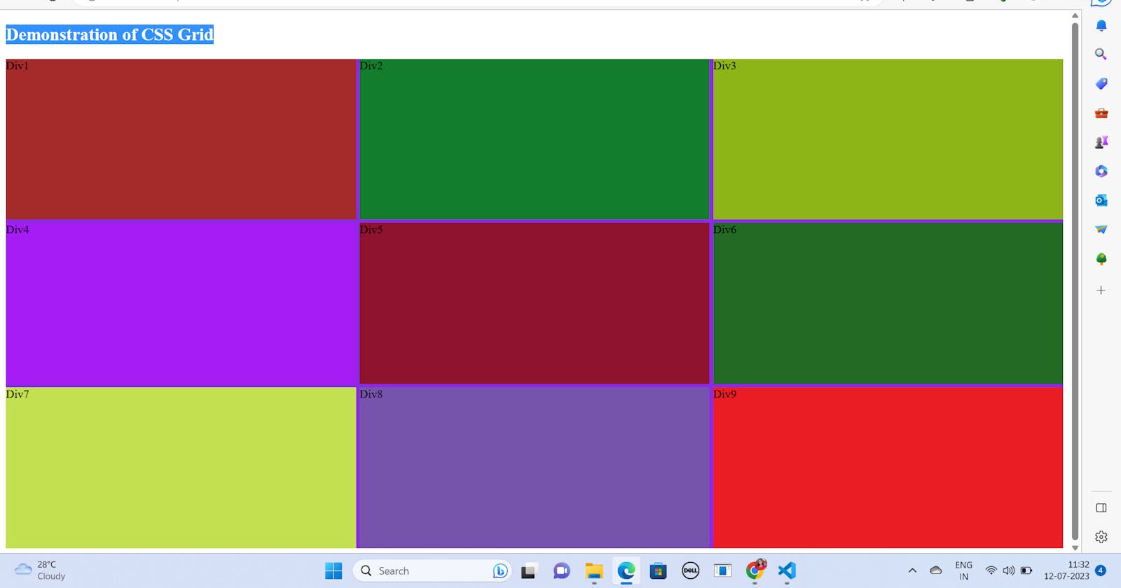
Code Snippet to demonstrate CSS Grid: