

Introduction:
In the world of web development, creating flexible and responsive layouts is crucial to providing optimal user experiences across devices. CSS Flexbox has emerged as a powerful tool for achieving these goals. In this article, we will explore the fundamentals of CSS Flexbox and delve into its key features, properties, and practical use cases. By the end, you'll have a solid understanding of Flexbox and be well-equipped to create dynamic and modern web layouts.
Understanding Flexbox:
CSS Flexbox, or Flexible Box Layout, is a module that provides a straightforward way to arrange and distribute elements within a container. Unlike the traditional block or inline layout models, Flexbox allows for dynamic and flexible designs that adapt to different screen sizes and orientations. It introduces two fundamental components: the flex container and flex items.
Setting up the Flex Container:
To enable Flexbox, you first need to designate a flex container. By applying display: flex; or display: inline-flex; to an element, you transform it into a flex container. The former renders it as a block-level container, while the latter treats it as an inline-level container.
Working with Flex Items:
Flex items are the children of a flex container. They are the elements that will be arranged and distributed within the container. By default, flex items will align in a single row, but you can control their behavior using various properties.
Controlling Flex Direction:
The flex-direction property determines the direction of the flex items within the container. It can be set to row (default), row-reverse, column, or column-reverse. This allows you to create both horizontal and vertical layouts effortlessly.
Adjusting Flexibility:
Flex items have the ability to grow and shrink based on available space. The flex-grow, flex-shrink, and flex-basis properties control these behaviors. You can assign flexible units to these properties to dictate how the items should expand, contract, or establish initial sizes.
Aligning and Justifying Flex Items:
Flexbox offers powerful alignment and justification capabilities. The align-items property controls the vertical alignment of flex items, while justify-content handles the horizontal alignment. These properties allow you to distribute items along both axes, enabling precise control over spacing and alignment.
Responsive Layouts with Flexbox:
Flexbox truly shines when it comes to responsive web design. Its fluid nature makes it easy to create layouts that adapt to different screen sizes and orientations. By leveraging media queries, you can adjust flex container and item properties dynamically, ensuring an optimal layout across a wide range of devices.
Real-World Use Cases:
Flexbox has countless practical applications. It is ideal for creating navigation menus, image galleries, grid layouts, and even complex multi-column forms. Additionally, combining Flexbox with other CSS features like CSS Grid enhances your ability to craft intricate and responsive designs.
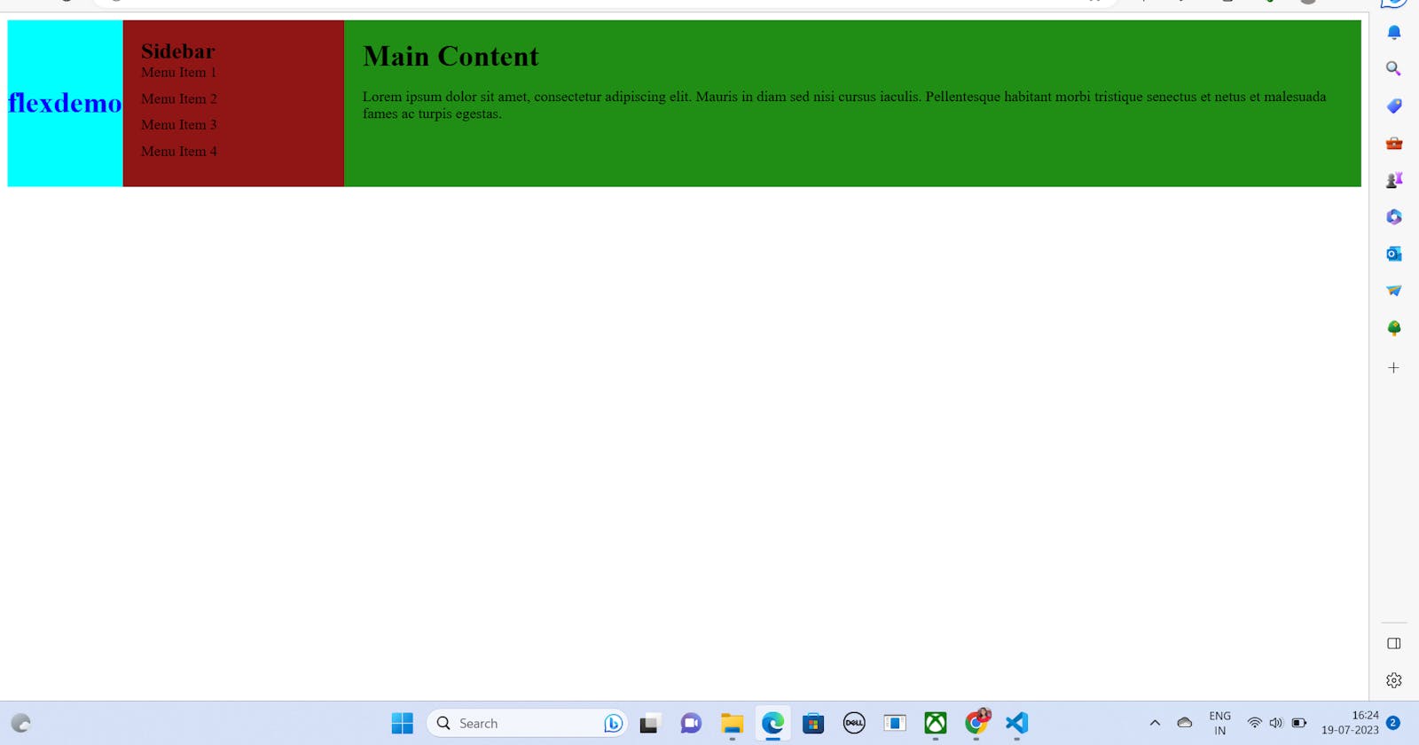
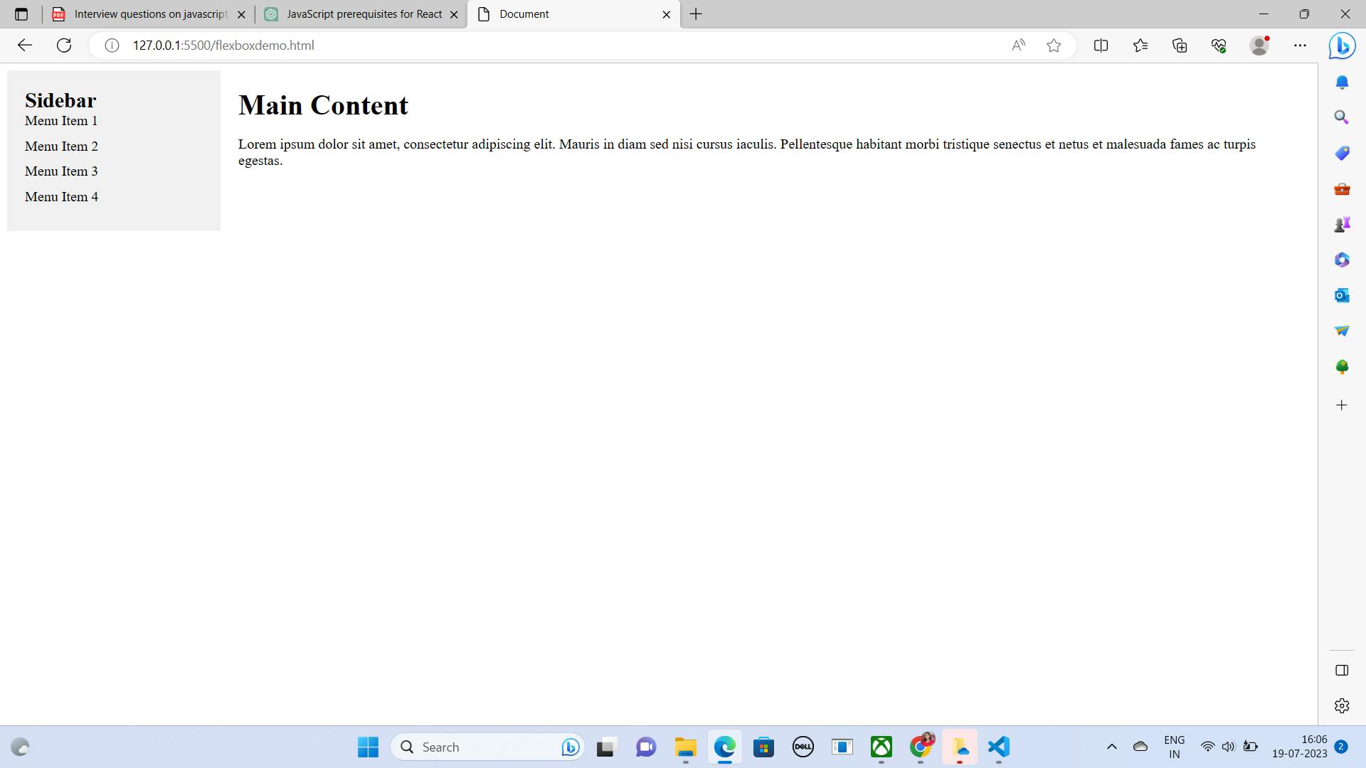
Code Snippets to demonstrate Flexbox:


Conclusion:
CSS Flexbox is an essential tool in the modern web developer's toolkit. With its intuitive and flexible approach to layout, it simplifies the creation of responsive and dynamic designs. By understanding the core principles of Flexbox and exploring its various properties, you are now equipped to build robust and adaptable web layouts. Embrace Flexbox, experiment with its capabilities, and unlock a new world of possibilities in your web development journey.